
When Breast Cancer Foundation reached out to us earlier in the year to be a partner for their BrArt Competition (a fashion and art design competition to spread awareness of Breast Cancer), we were honoured, proud and nervous. We are a lean team. A lot of the time, we get by because we prioritize efficiency and truthfully, work our ass off.
We've been actively raising awareness about Breast Cancer ever since the inception of the brand in 2017, and every time, we try to do better, do bigger. Last year, we designed a front close bralette with survivors in mind. So to be able to be an official partner and work closely with the foundation that rallies for a cause so close to our hearts - it is like a dream come true.
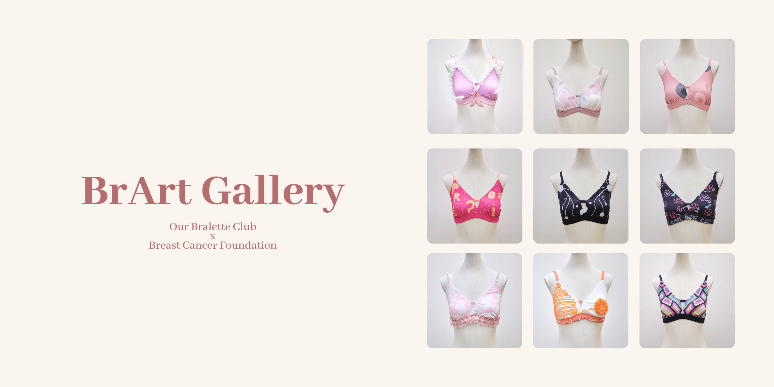
We helped to produce 10 bralettes designed by very talented individuals and sold BrArt DIY Kits at no profit - all in the hopes of raising awareness of breast cancer through art, design and fashion. It's been a long and arduous six months of planning, discussions, executions and revisions, but seeing your support, contribution and the fruit of all our labour, it is all worth it.
Here are the different submissions we've received - we hope you enjoy them and the stories behind them!
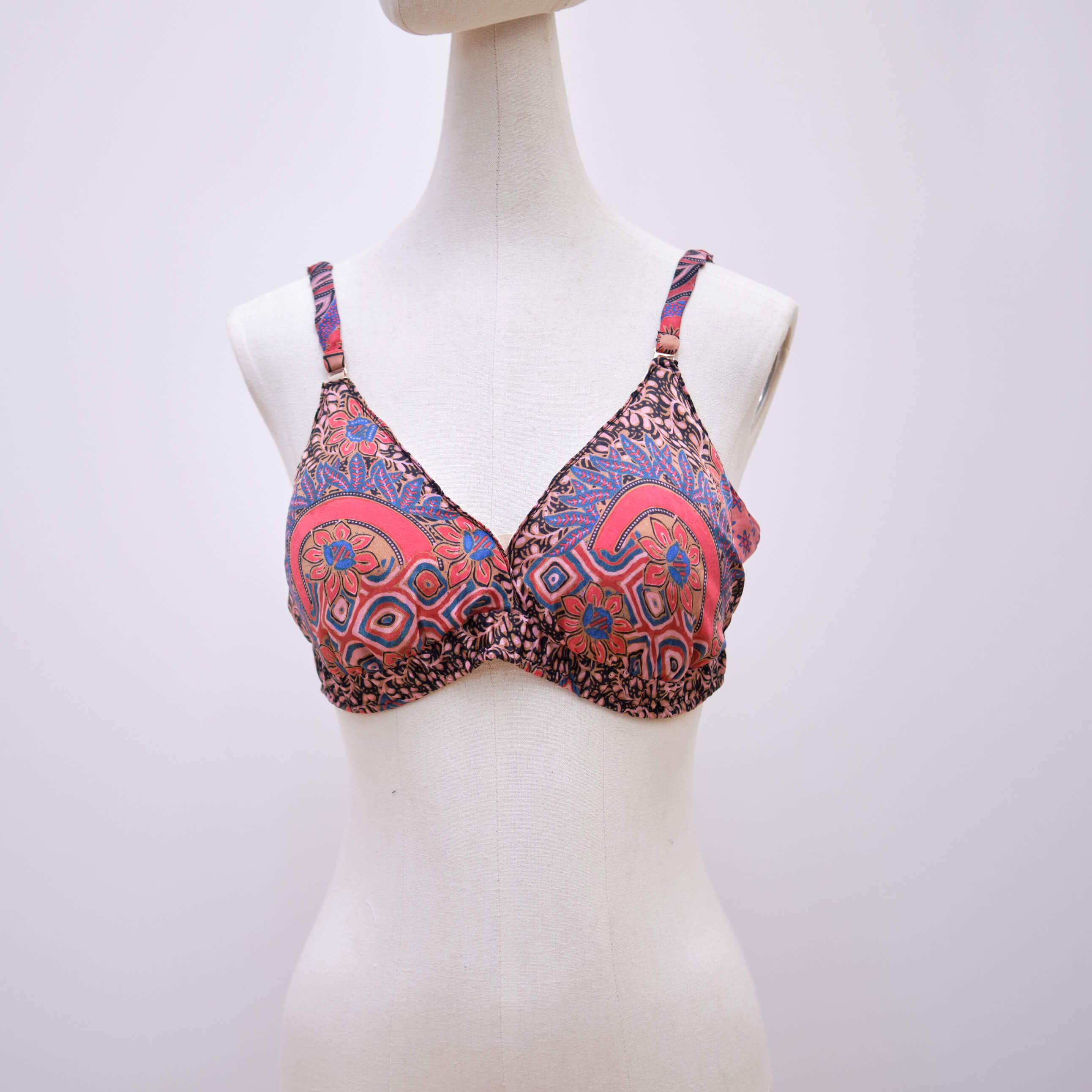
BrArt Design Competition Top 10
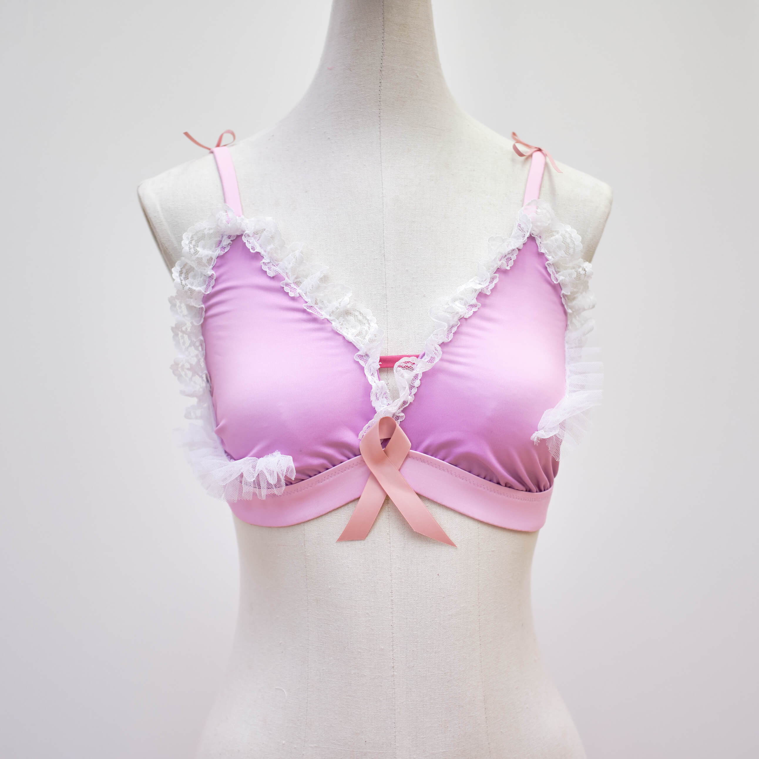
My design was inspired by all women who have battled or are currently fighting breast cancer. Their perseverance and courage in enduring this difficult and frightening process are admirable.The pink ribbon was added to remind people that breast cancer exists and that those who’re facing it are not alone. Neither should they be afraid to talk about it nor seek help from loved ones.
Lina Tan Jen Nah
Breast cancer scars can significantly impact one's self-confidence, intimacy and body image. Being able to feel beautiful is an idea that no one should be ashamed of. I wanted to create a design that embraced a survivor's scars and demonstrated the elegance, femininity and beauty within it. The presence of scars is not abnormal and shouldn't be able to define a person or be given the power to take love away from oneself.
May-Ane Chew
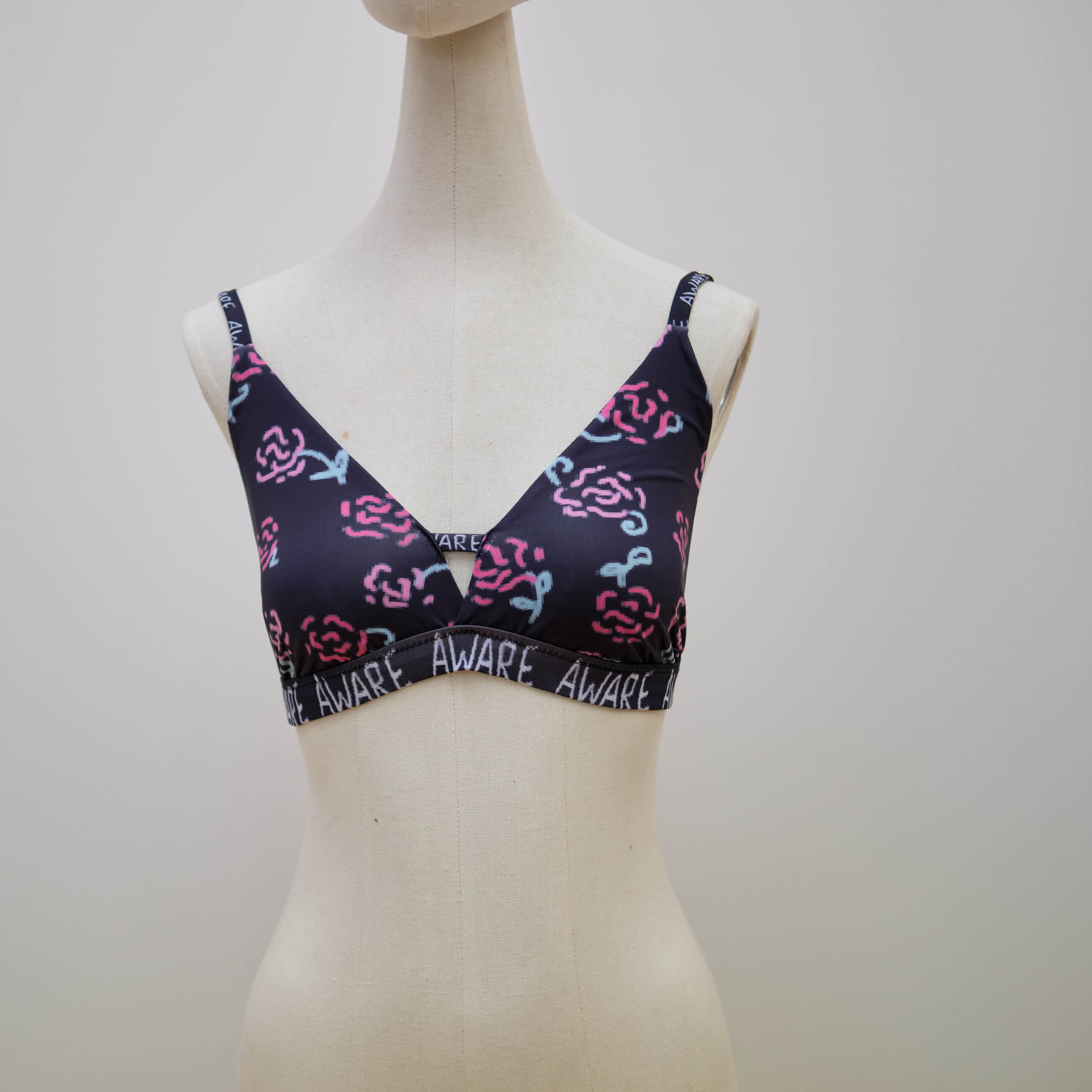
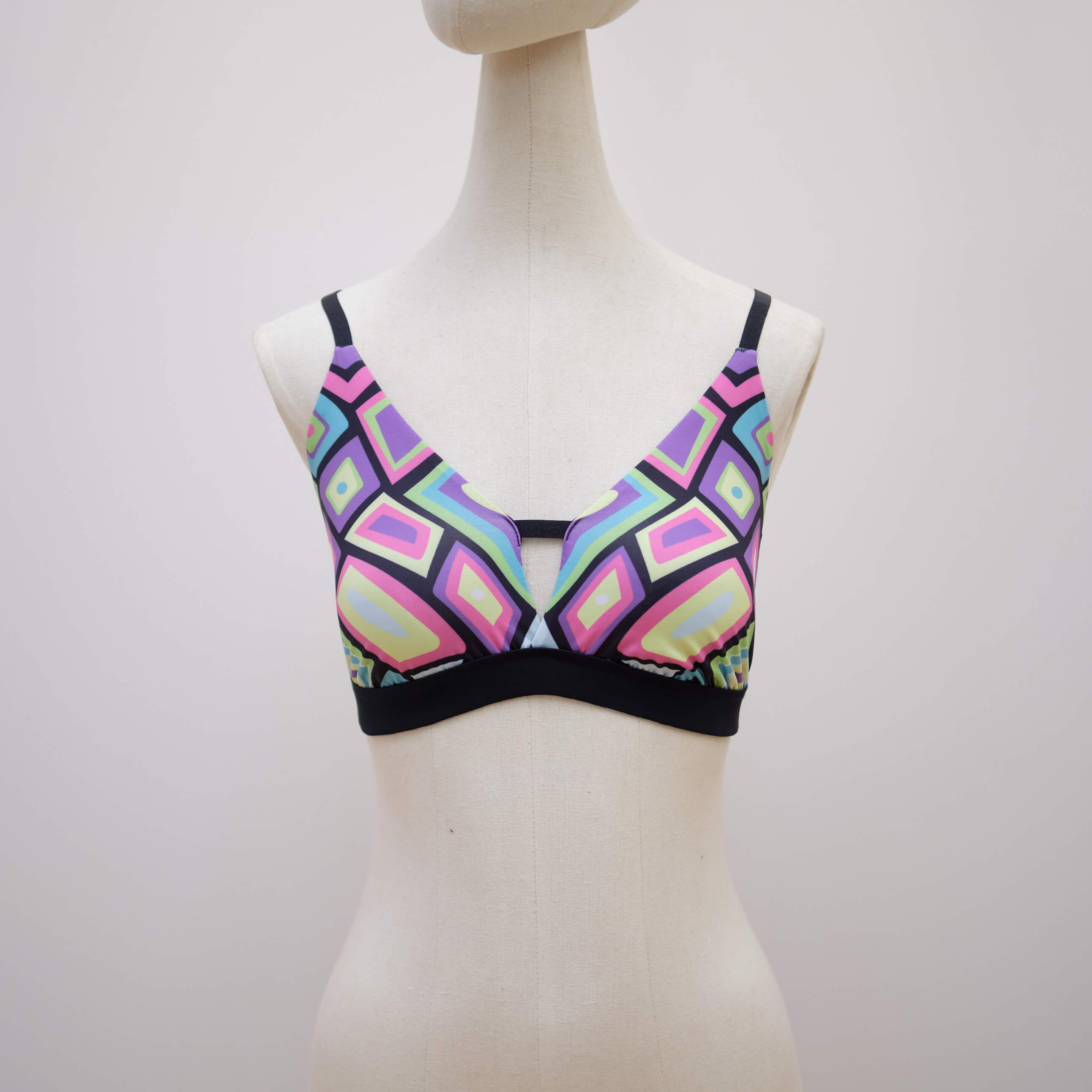
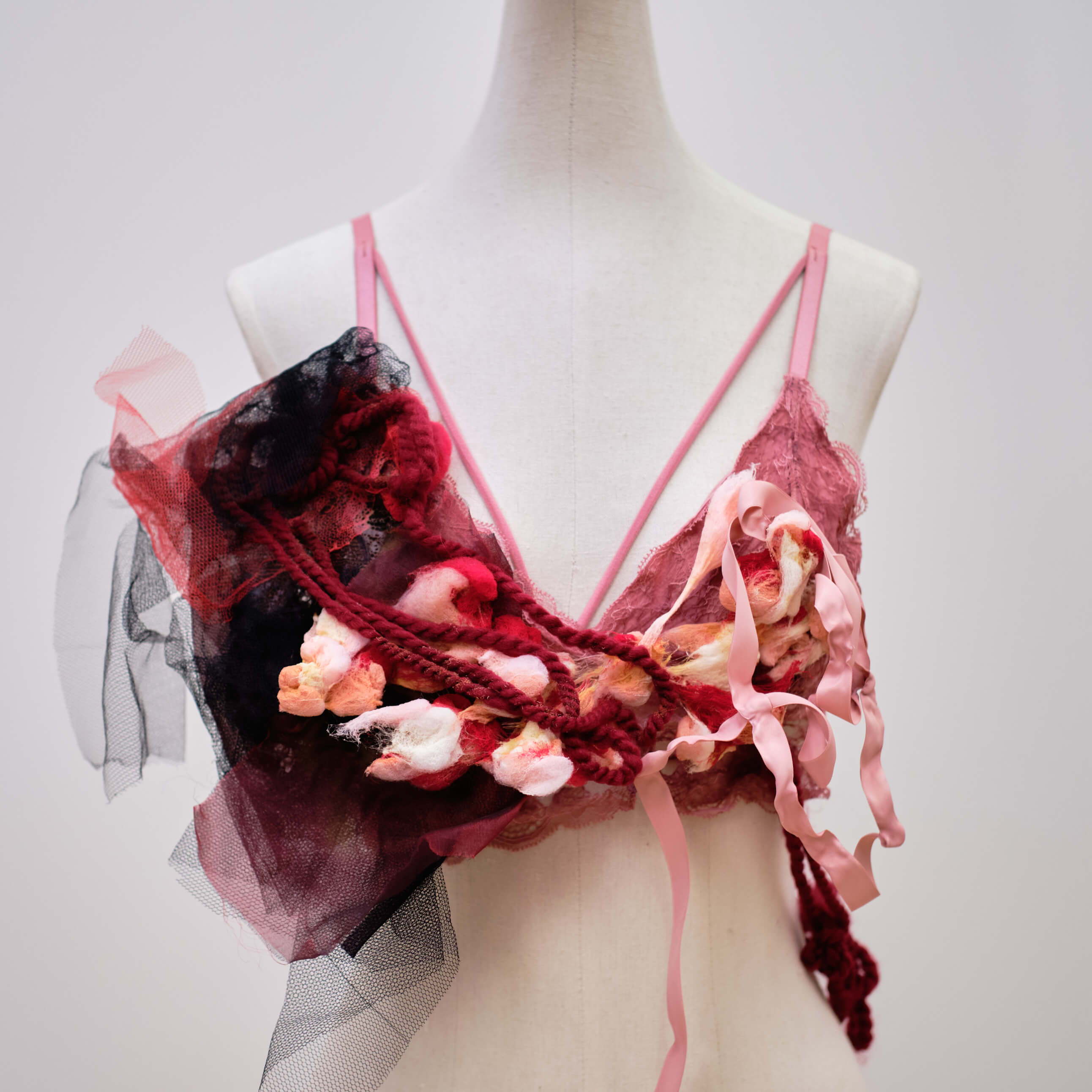
The design revolves around breast cancer fighters and survivors, allowing a more visual representation of the relationship between the two. On the left is the cancer survivor, whose hair has been shaved off for treatment. Her body is covered in medical gauze. The survivors are surrounded by many rosebushes, signalling the beginning of a new flowering period after a successful treatment. The survivors are like a light to the cancer fighters, giving them hope that they too can recover one day.
Long Zicheng
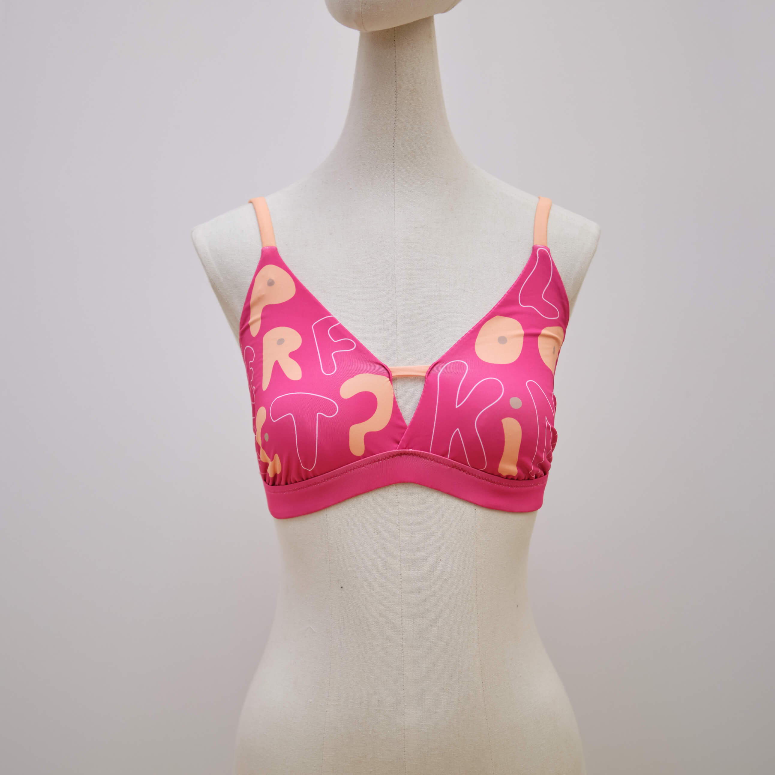
“Looking Perfect,” but in a lumps’ irregular shape, describing breasts in a cancer is a typographical trendy design. The concept behind it is to portray the irony behind perfect breast but from inside, there is a disease that is spoiling the breast and makes the patient feel very uneasy.
It is time everyone understands the complications behind it and stops admiring the outer beauty.
Ishita Singla
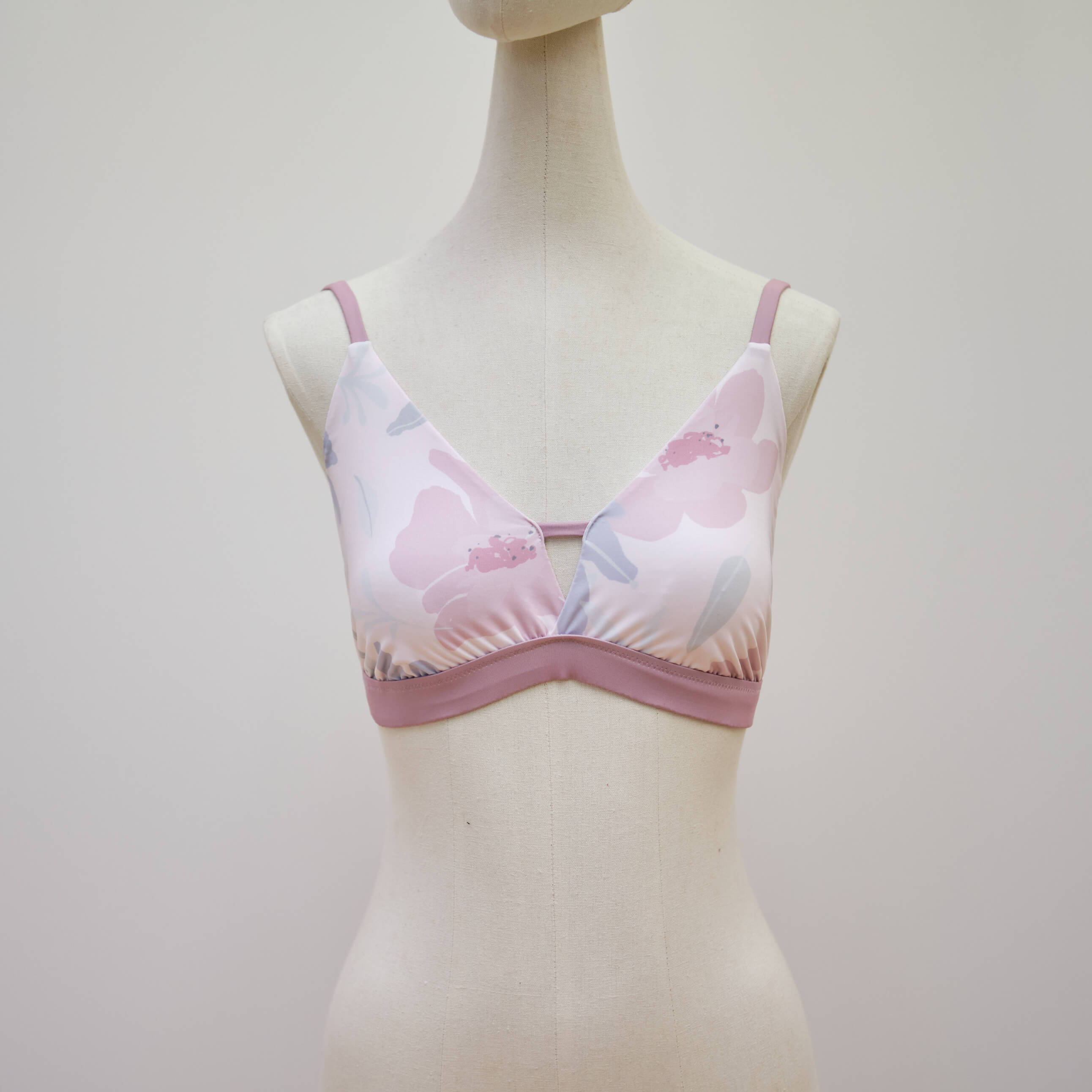
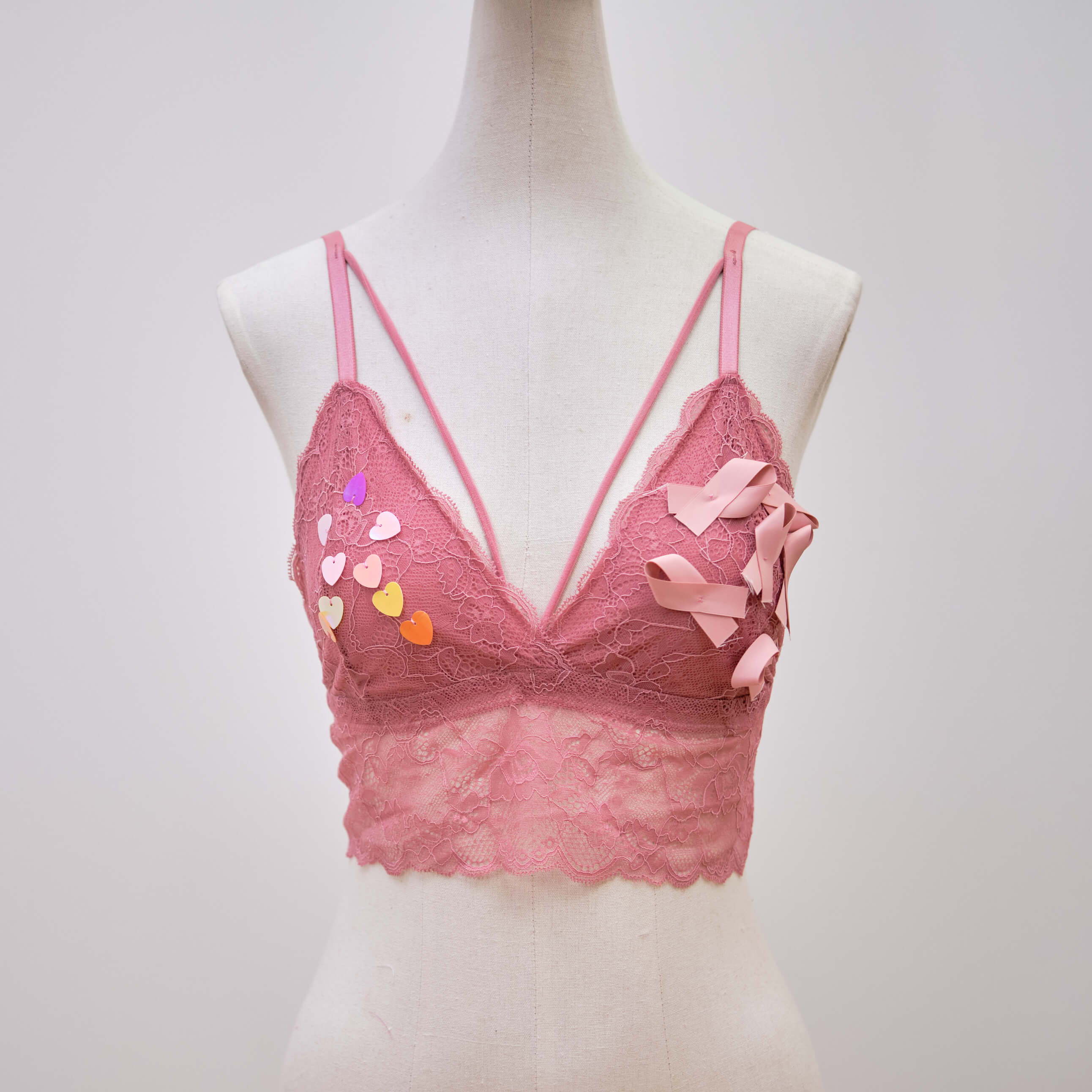
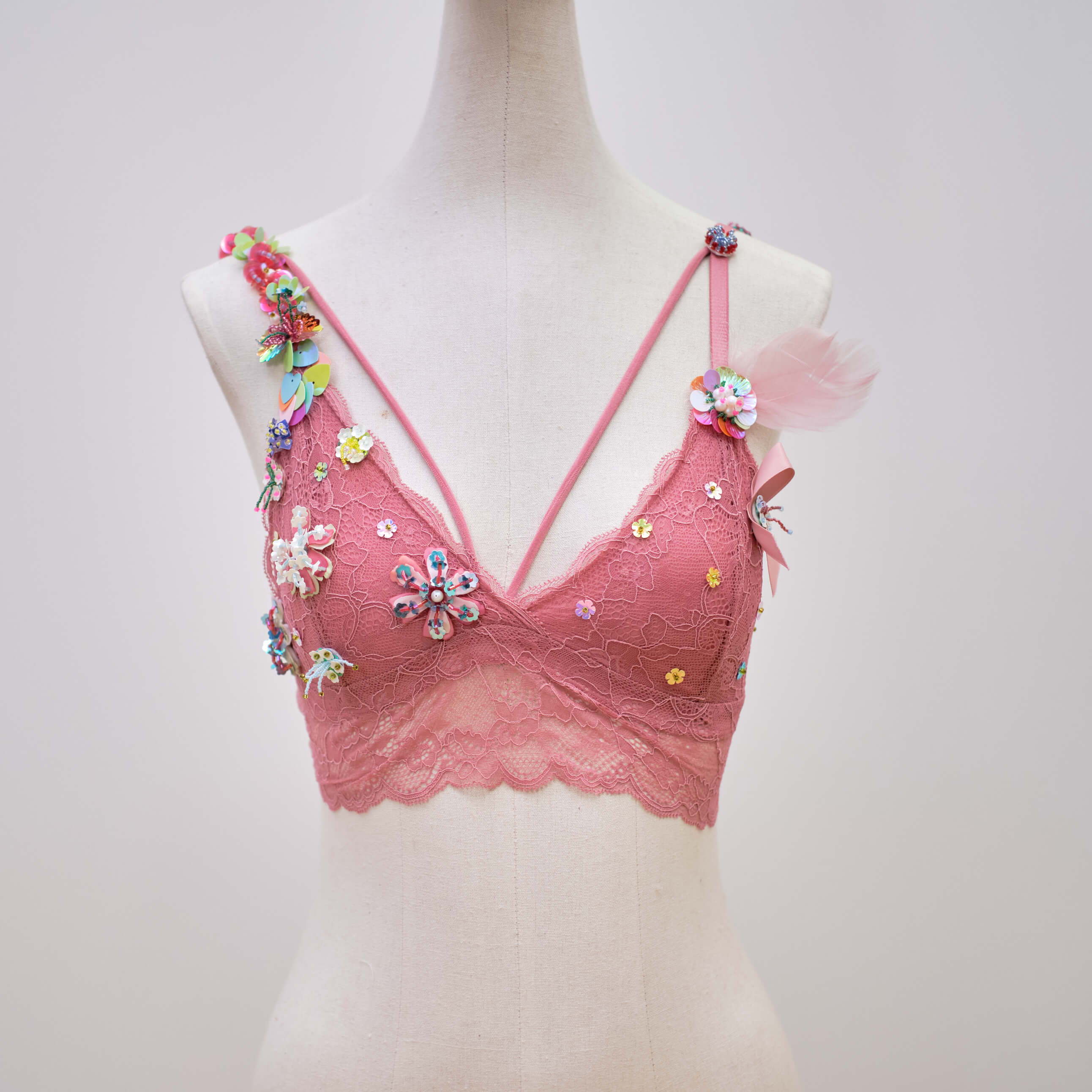
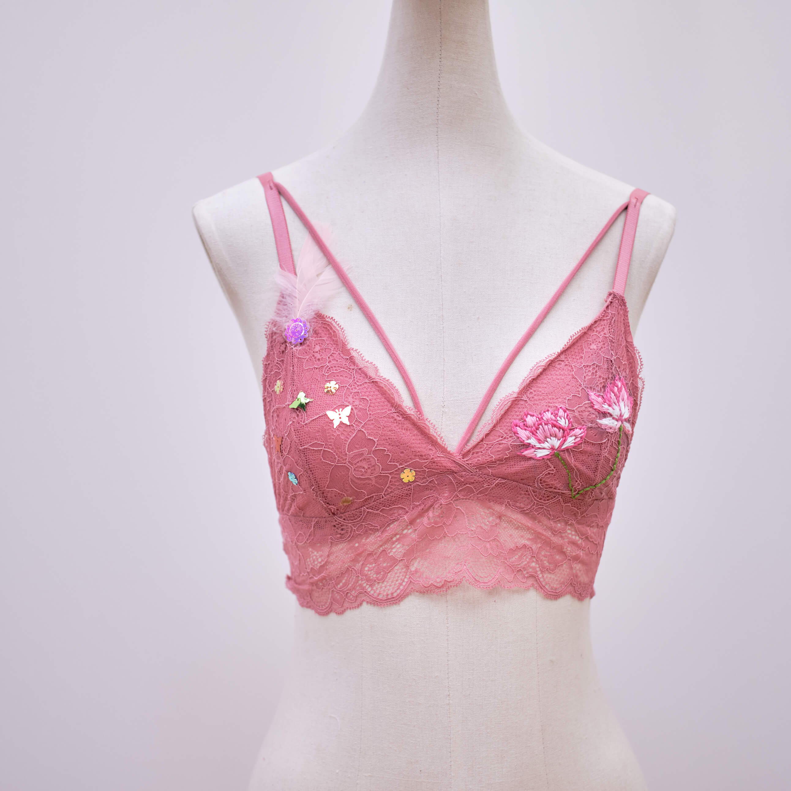
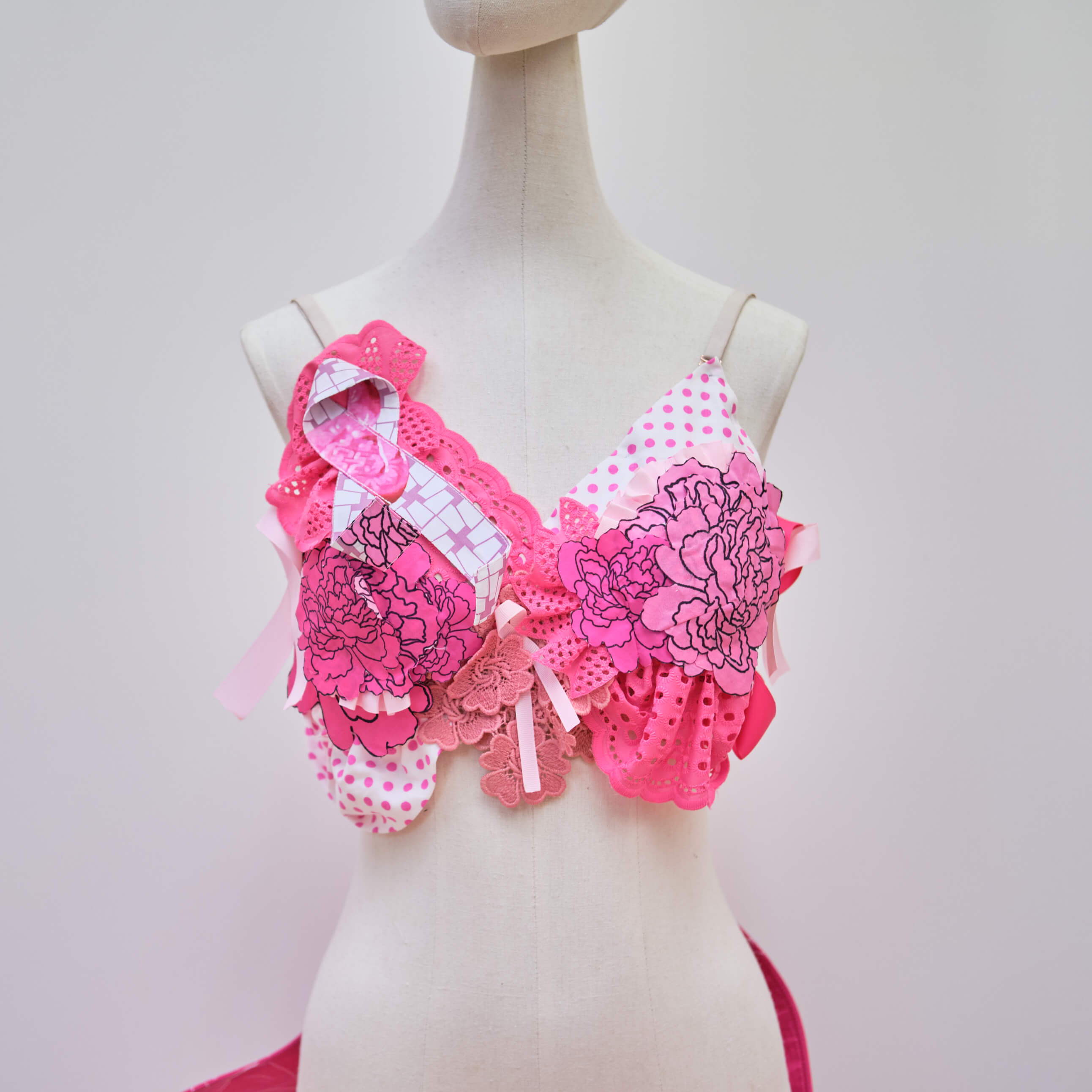
I was inspired by the flowy shape of the pink ribbon. It reminded me of organic flower petals. I wanted to design a bralette that felt like a breath of air, comforting and yet cheeky. It is a design that honours the survivors, remember those that lost to the disease. And a symbol of continual progress towards defeating breast cancer.
Diane Lim
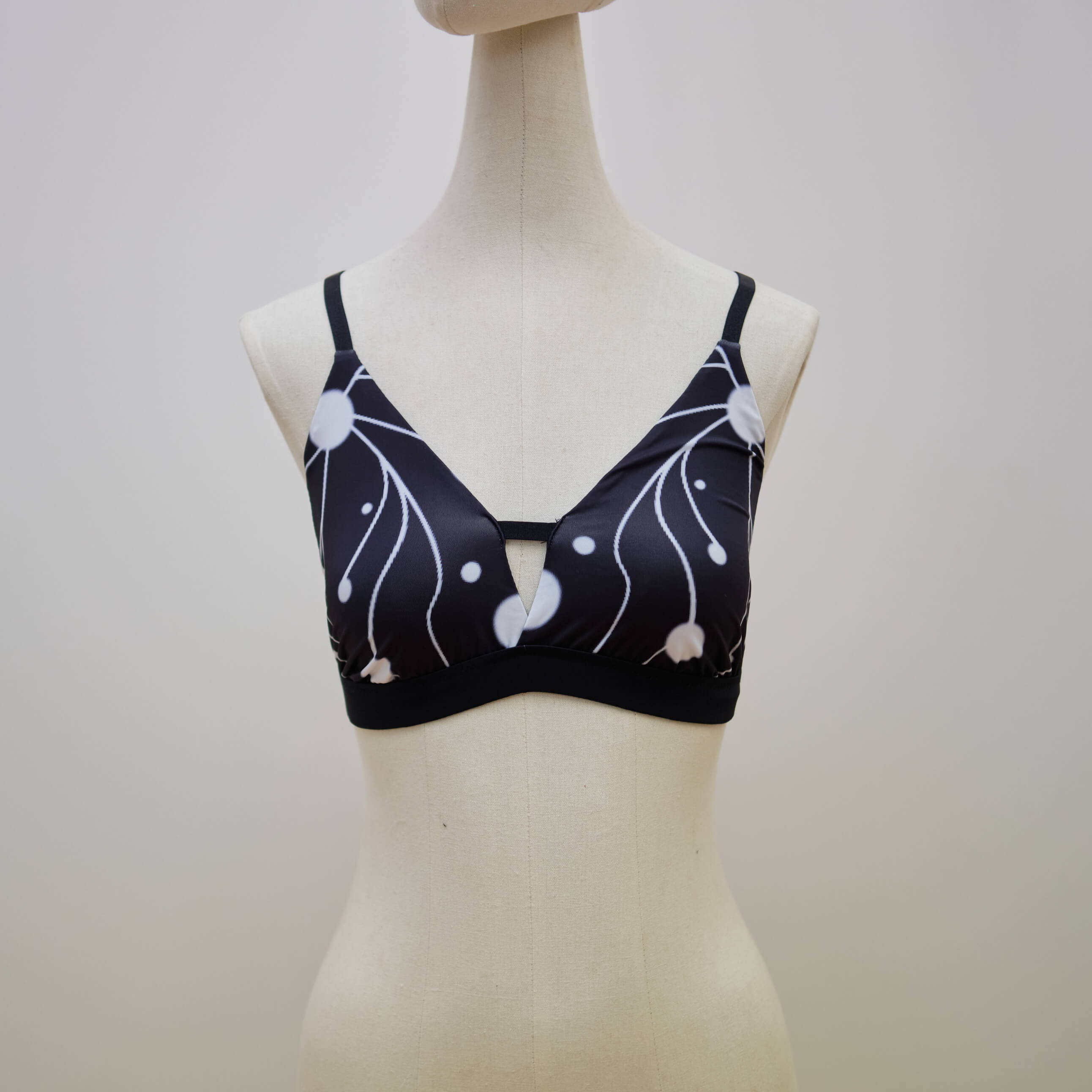
The bralette design uses dots and lines to represent the tendency of lymphedema and its spread in the breast, warning people of the need to always be aware of their own safety as well as timely checkups to prevent breast cancer
Huo Siyu
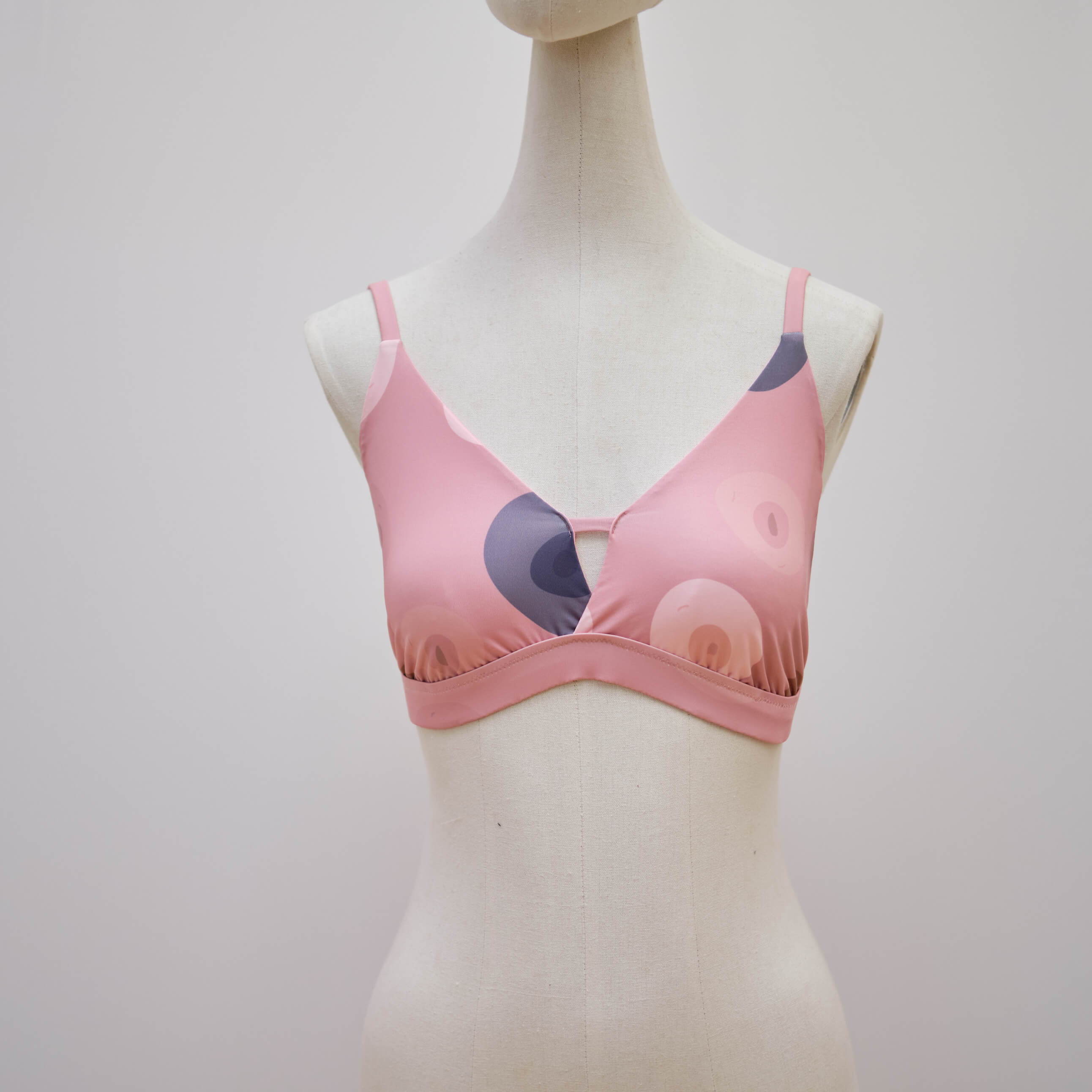
The design for this bralette w inspired by nipples of all women.
The nipples are intentionally misshapen, dissimilar, and imperfect. Not only does it highlight that breasts and areolas are not always shaped perfectly, the drawings also raise awareness of breast cancer symptoms like dimples, lumps, and irregularly shaped breasts and nipples.
Zoe Yee
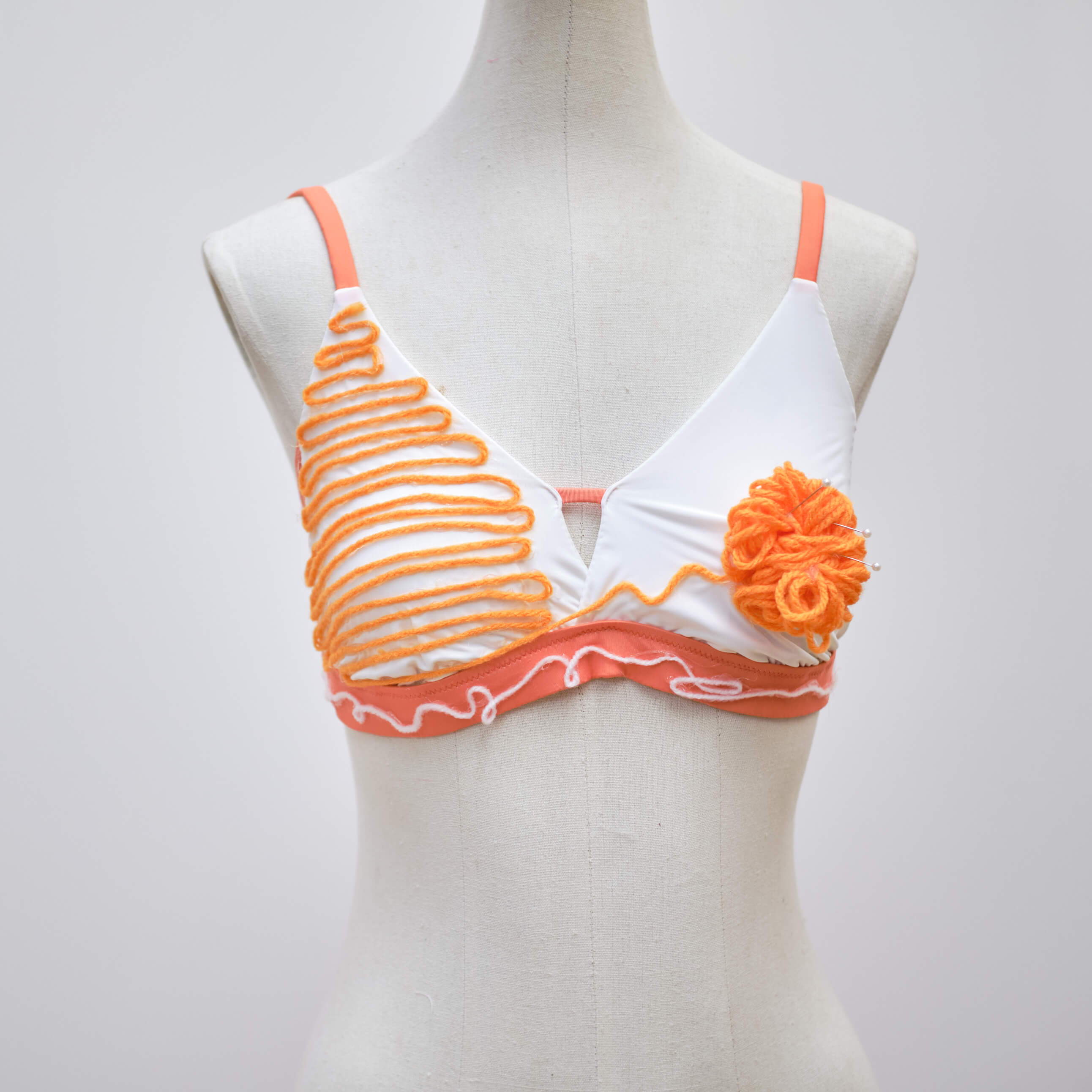
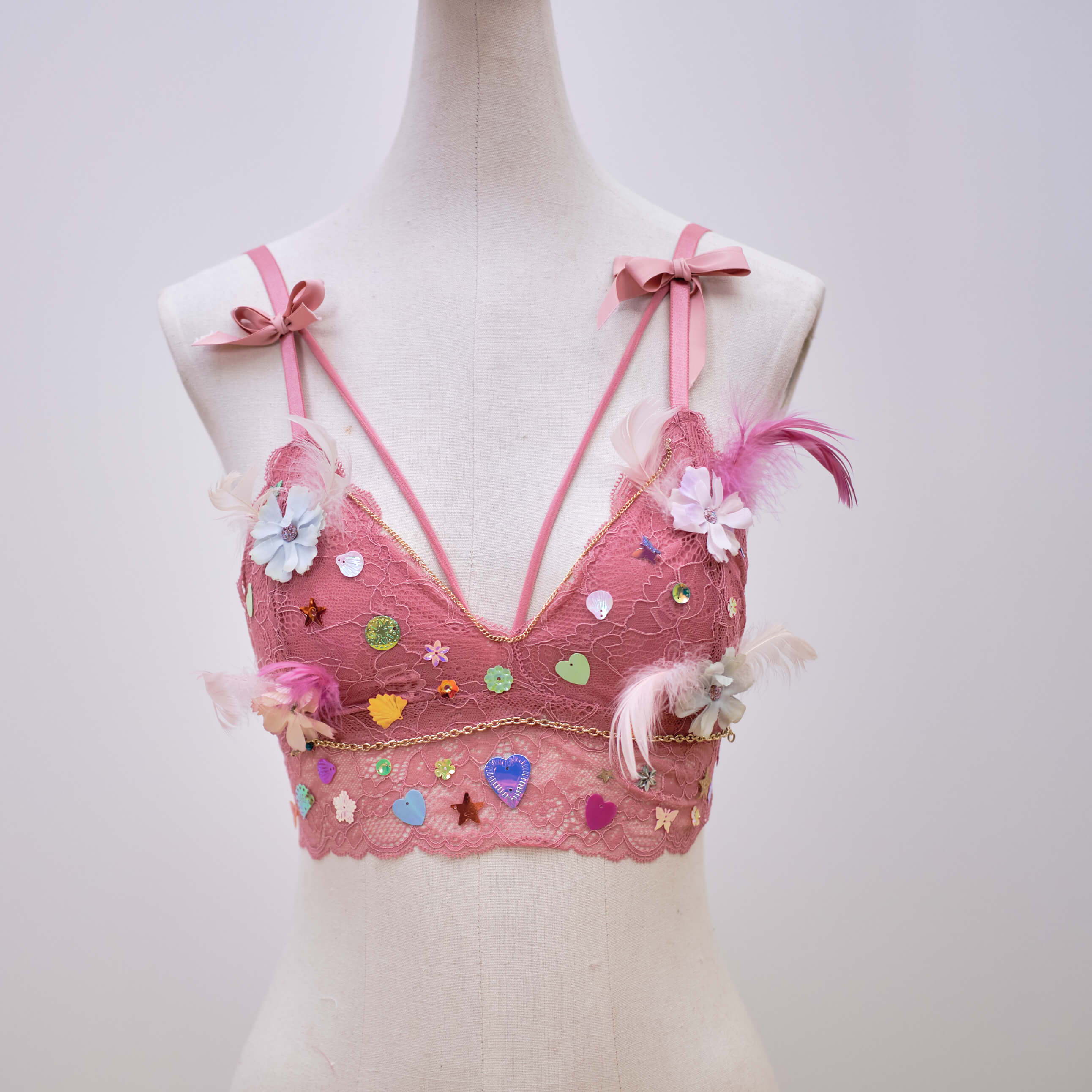
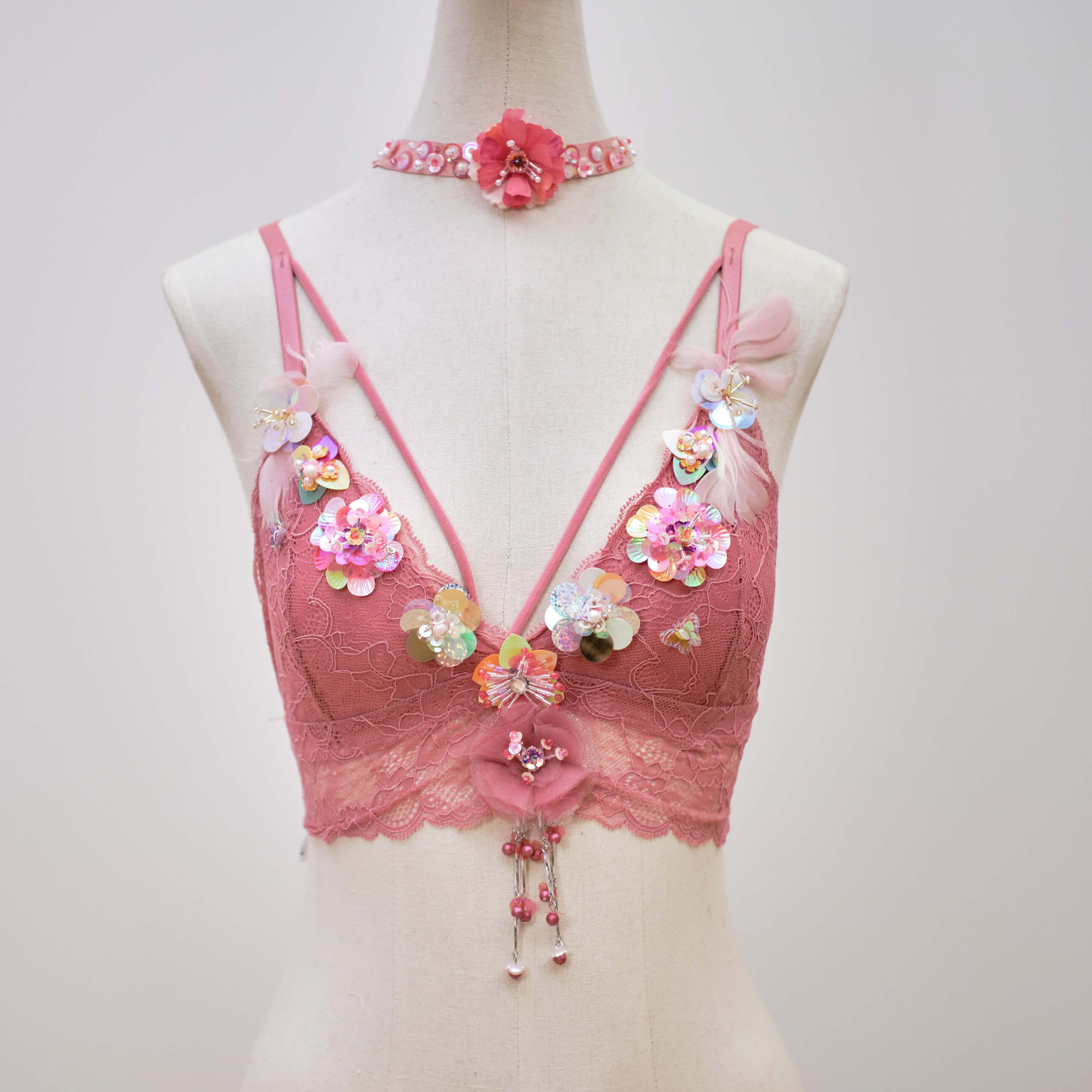
My inspiration is that as a teenager at a young age, I have no knowledge about breast cancer, thanks to this competition, I did research about this cancer, and I get to understand it. As I consider that there are many people like me, who are rid of breast cancer knowledge, therefore, I came up with the concept that tries to help people understand more about breast cancer. Whenever we think about symptoms of any illness, we usually feel negative because it looks unpretty. My goal is to make it look more easy-looking for people to accept it and get to know more about breast cancer symptoms.
Fiona Nguyen
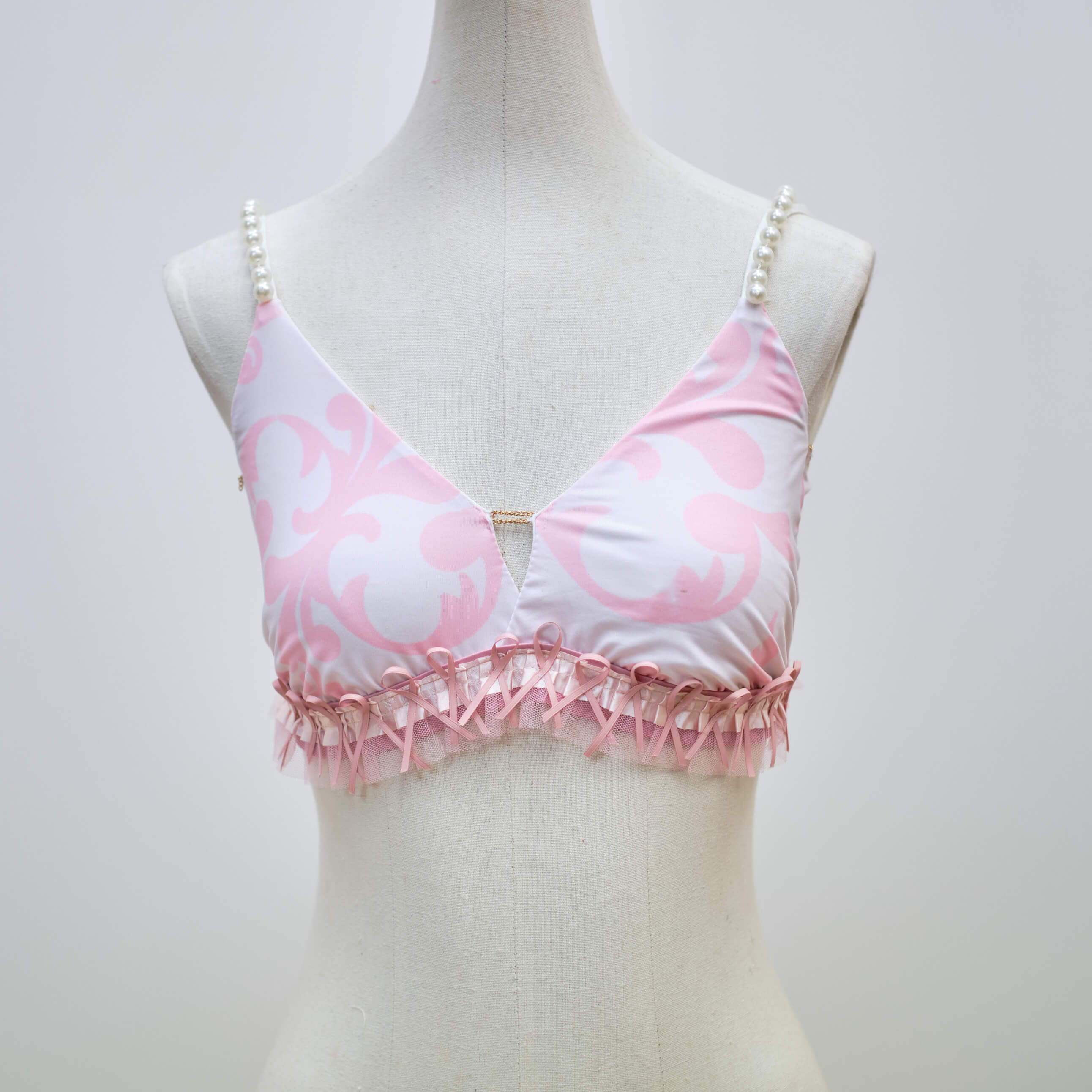
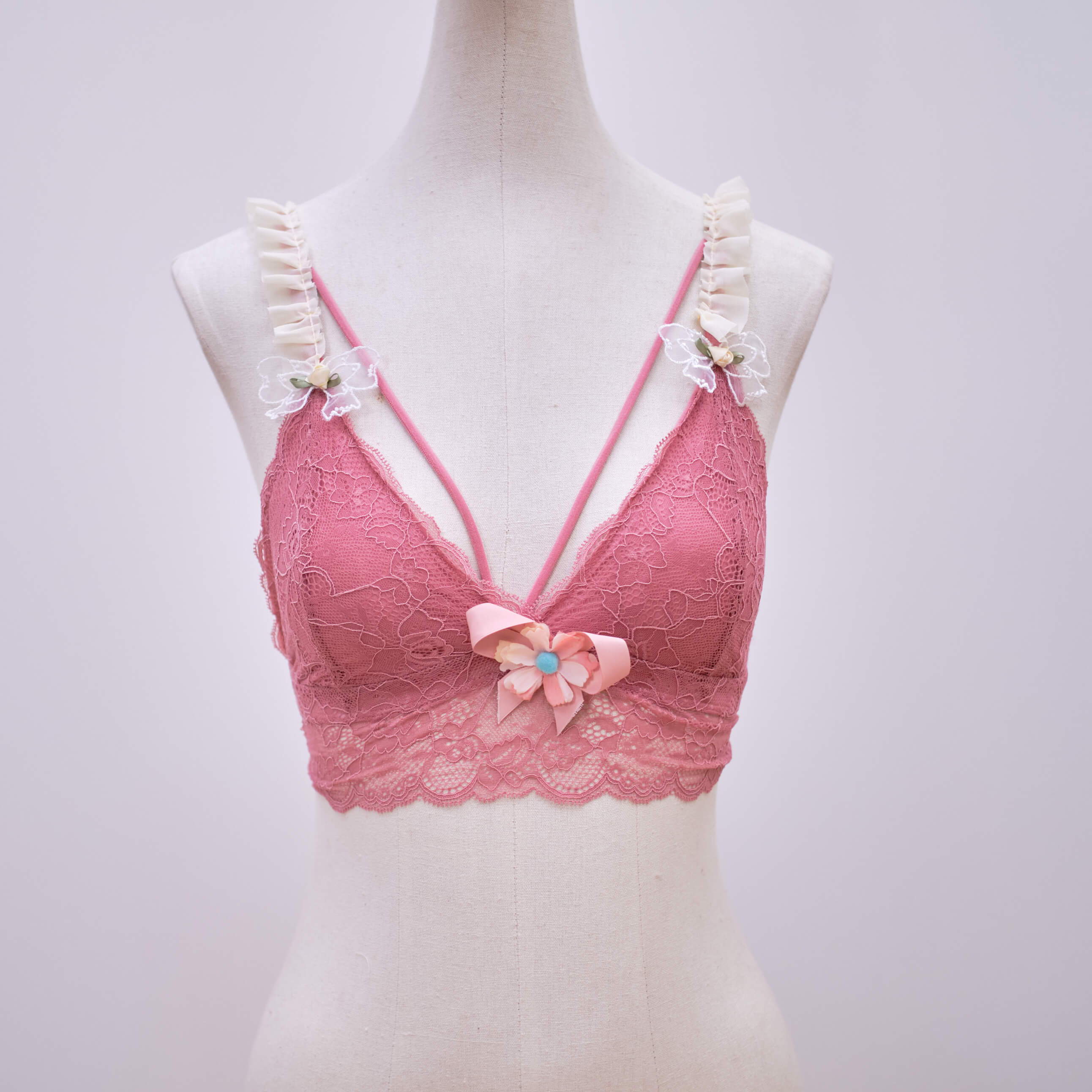
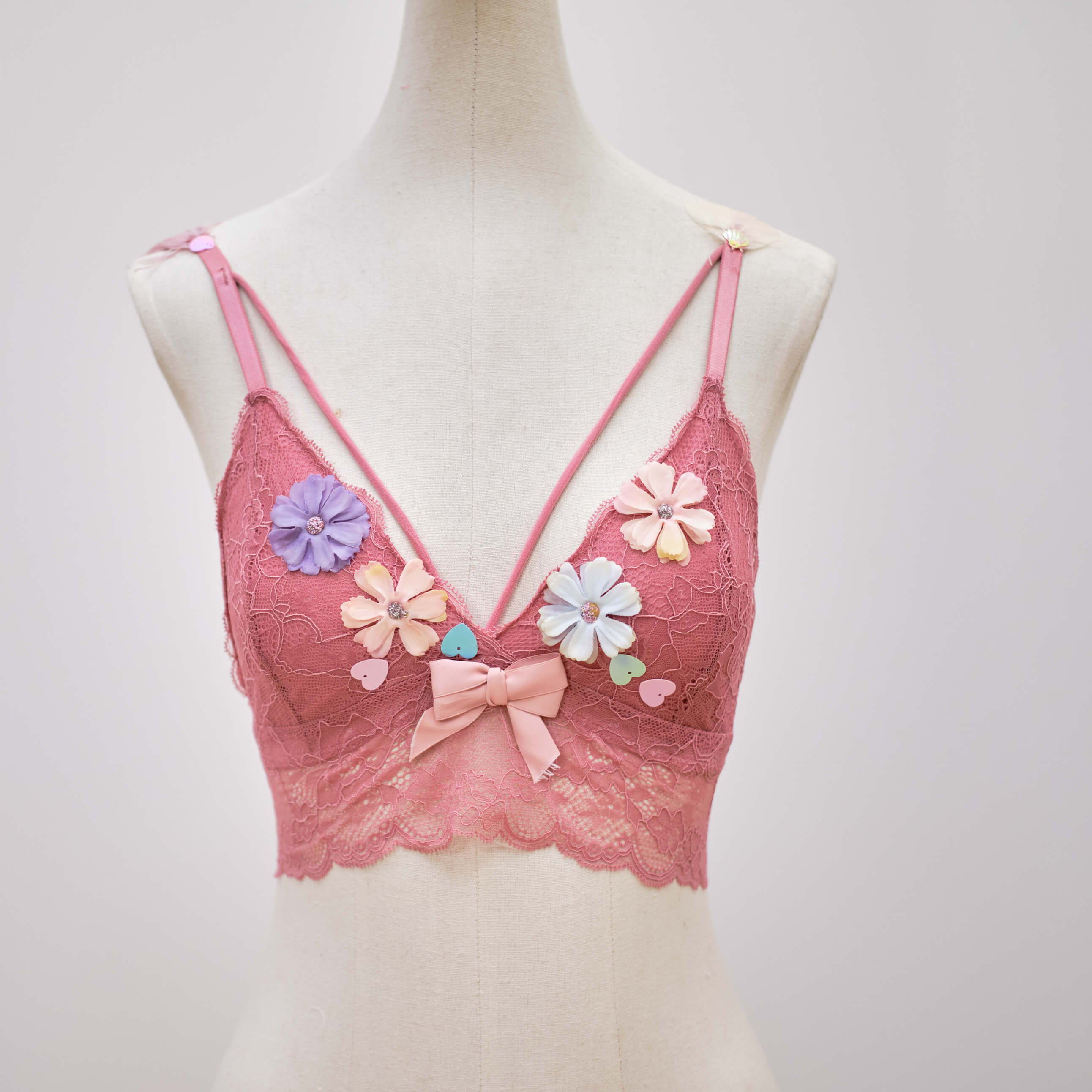
The bra is inspired by the coquette aesthetic, the embodiment of femininity and the use of pearls along the bra
symbolises divine protection and good luck.
Monineath Hou
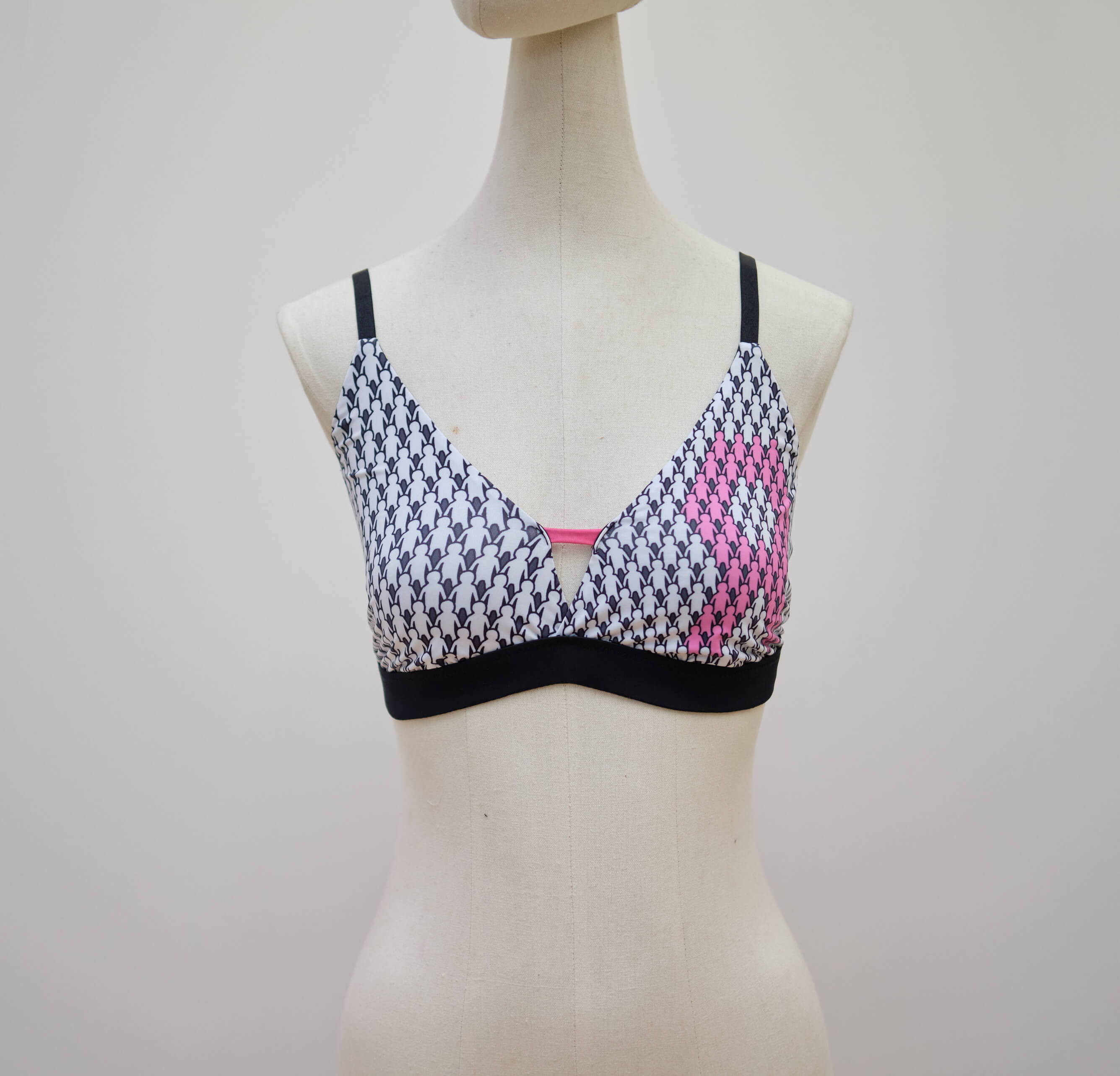
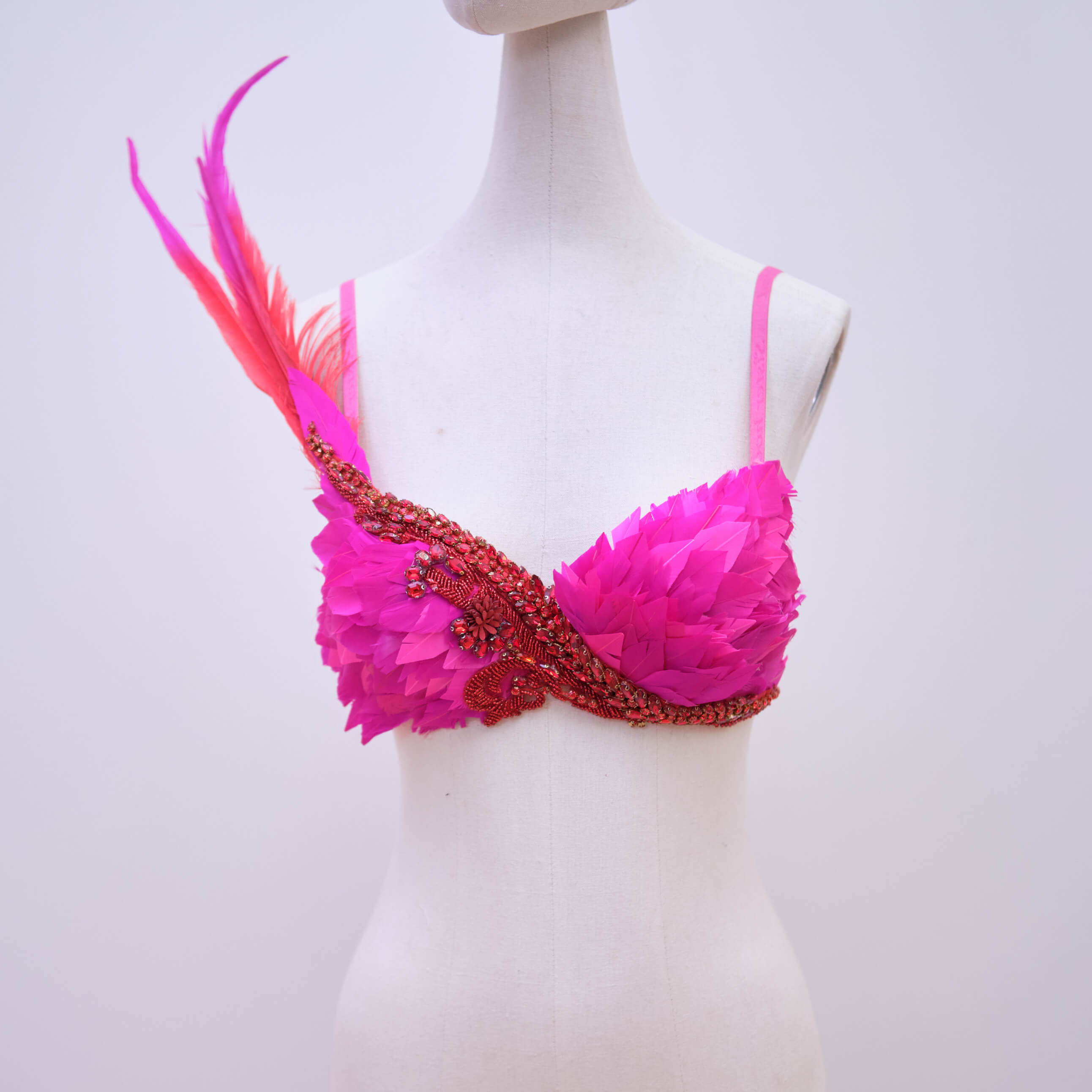
This project is designed to tell people that anyone can get breast cancer and that people need to love each other. In the past, lung cancer has always been the most common cancer in the world, but the latest data in 2020 show that the number of new breast cancers reached 2.26 million, and lung cancer was 2.2 million. Breast cancer officially replaced lung cancer and became the world's largest cancer. I designed a bra with lots of people holding hands and some of them were pink and made up the Breast Cancer Organization logo.
Qucheng Ding
Community Submissions
Josephine Foong
Monica Lawrence
Jia Yuan Li
Jia Yuan Li
Sarah Samantha Napitupulu
Jessie Tan
Angeline Hoshi
Josephine Ong
Designer Contributions

Selected BrArt designs are available for viewing at Ion Orchard Singapore from now till end of October 2022.